Work
Here’s where we pin our colours to the mast.
Portishead locals call their town ‘Posset’, in the same way that Newcastle is ‘the Toon’.
Posset Live is the events organisation that runs Portishead’s Christmas lights switch-on, Summer and Winter markets, and the Remembrance Day parade.
We helped them find a name and created a complete identity: brand story, strapline, tone of voice, typography, logo, design assets, colours, and comms.
“Rik has worked with the events group and Portishead Christmas lights to create the new Posset Live brand and identity. His guidance and advice has been invaluable and shows great skill and knowledge , while demonstrating understanding of the purpose of the group.
"A great listening ear that produces excellent designs and captured the essence and aims of what we do.”
Jane Victoria, Posset Live
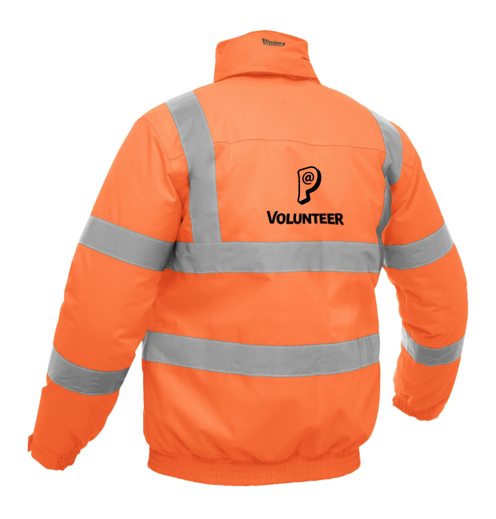


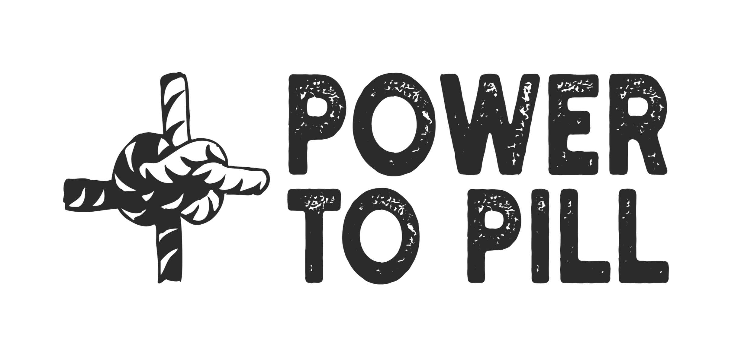
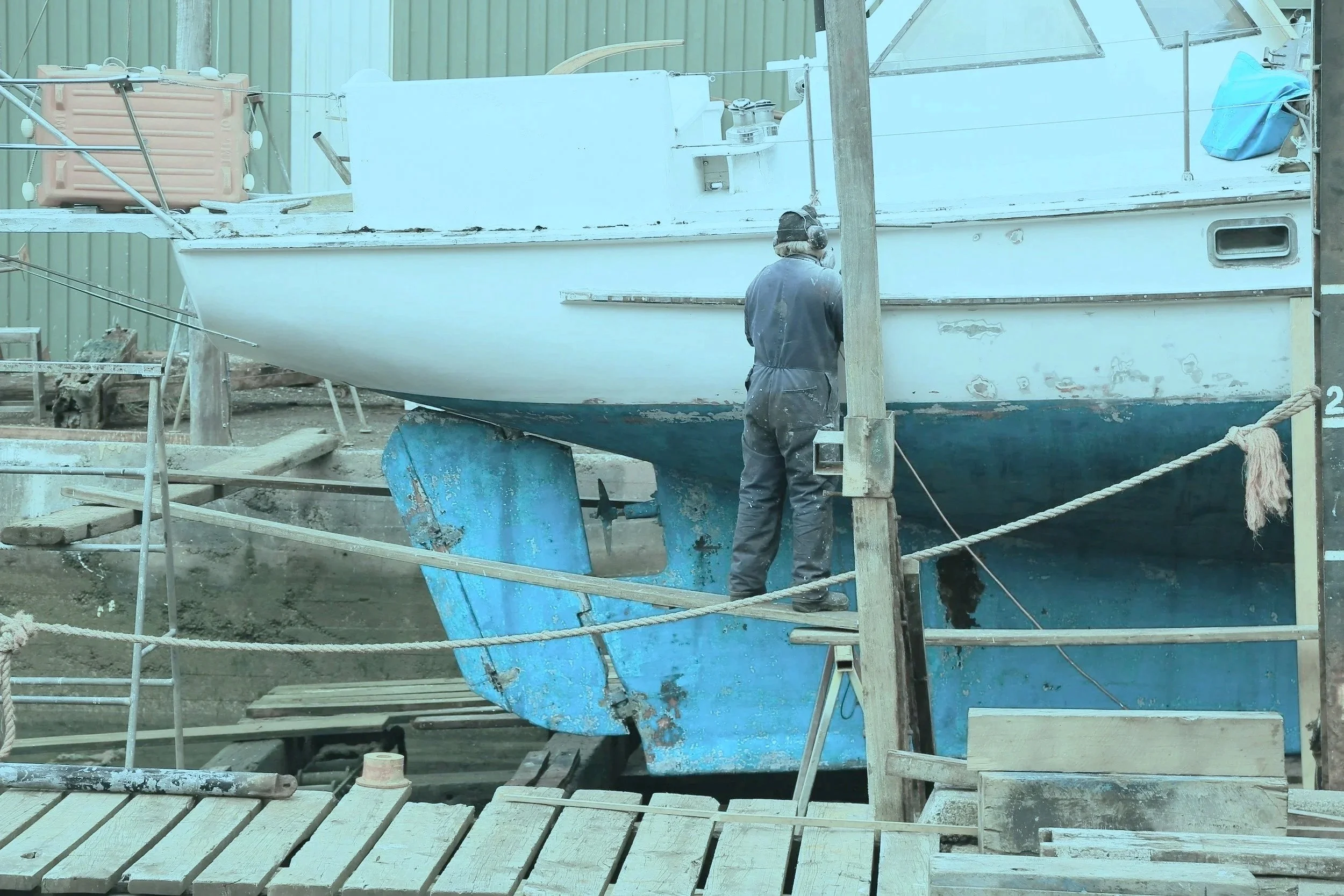
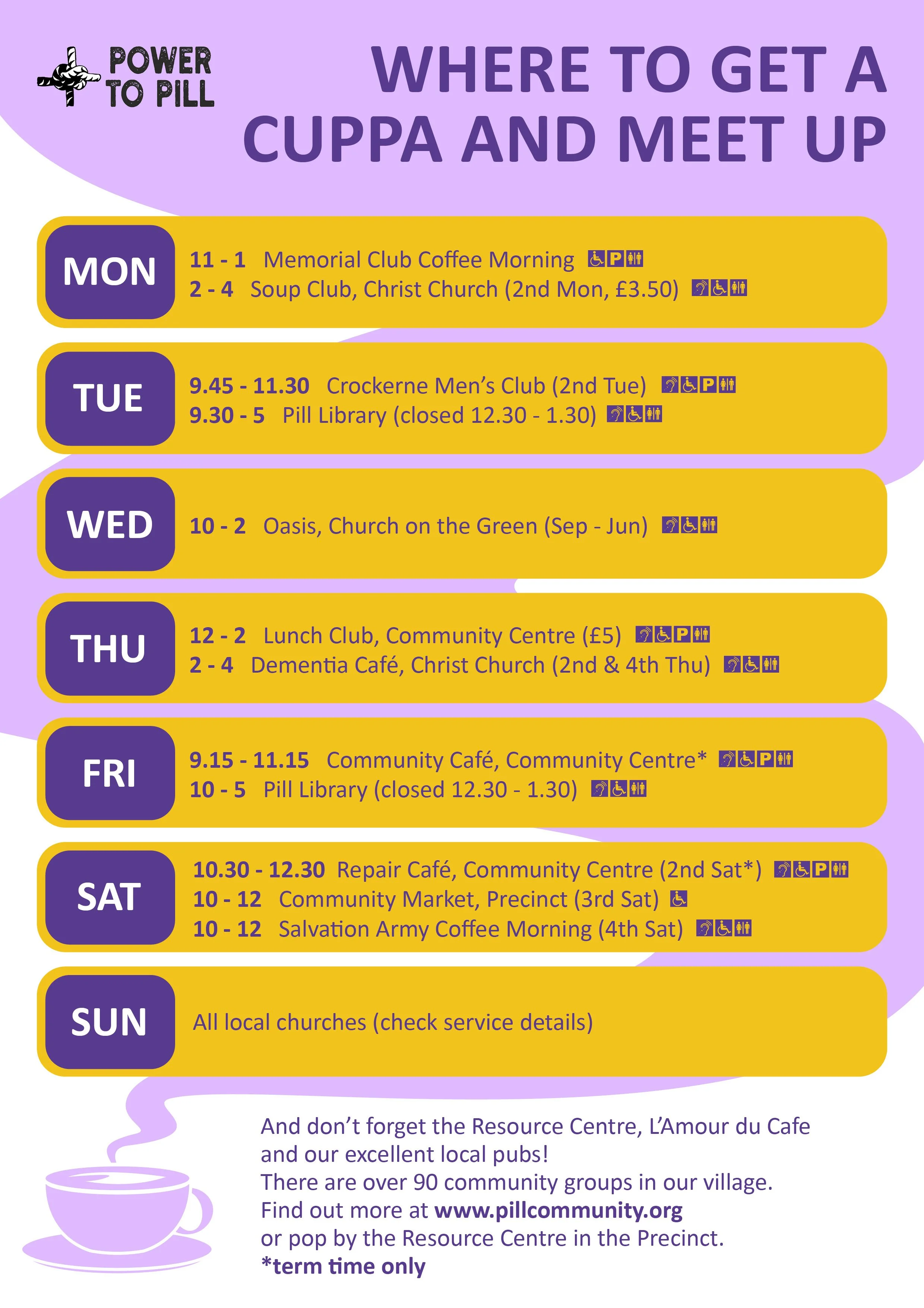
Power to Pill is a community engagement project in North Somerset, taking an ‘Asset Based Community Development’ approach to working within the combined community of Pill, Easton-in-Gordano and Ham Green.
Their logo needed to feel like it was generated locally, and represent the independent spirit of the village, and it needed to tell the story of a project bringing together local skills and resources to serve the community.
The knot represents strength and cooperation, refers back to Pill's maritime history, and resembles + to show the project's positive impact.
“It was a pleasure working with Rik on the Power to Pill Project. Not only was he a delight to work with, he listened to our needs and strict parameters, coming up with various options ... all of which we could have used! His creativity and professionalism is second to none and I cannot recommend him highly enough. “
Tina Huckle-Mills, WERN
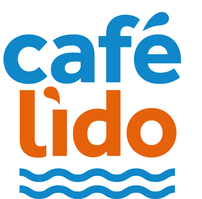
Café Lido is the restaurant for the Portishead Open Air Pool, but their logo felt at odds with the Pool’s identity.
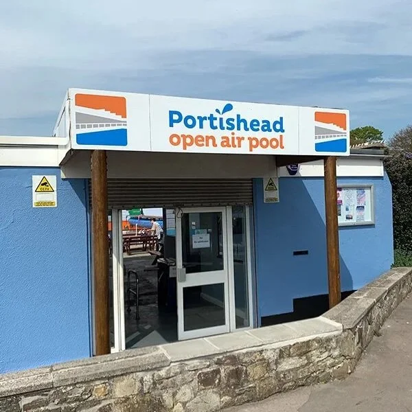
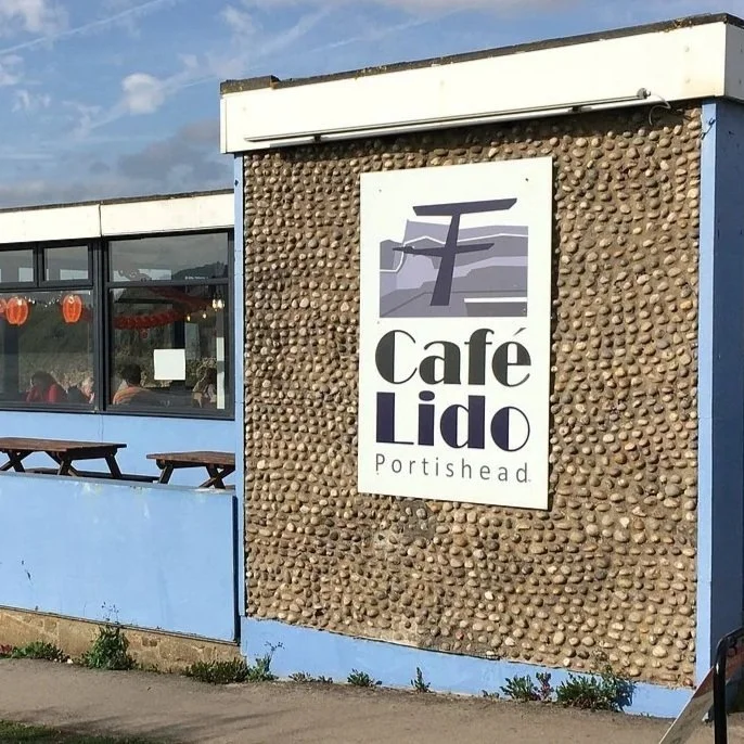
We simplified the layout and used the splash device and colours from the Pool’s logo to create synergy and make the Café logo feel more contemporary and playful.
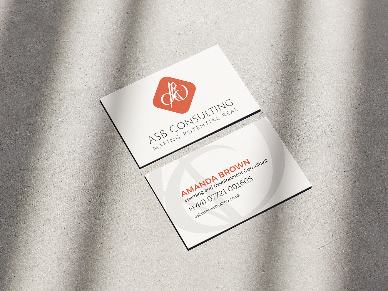
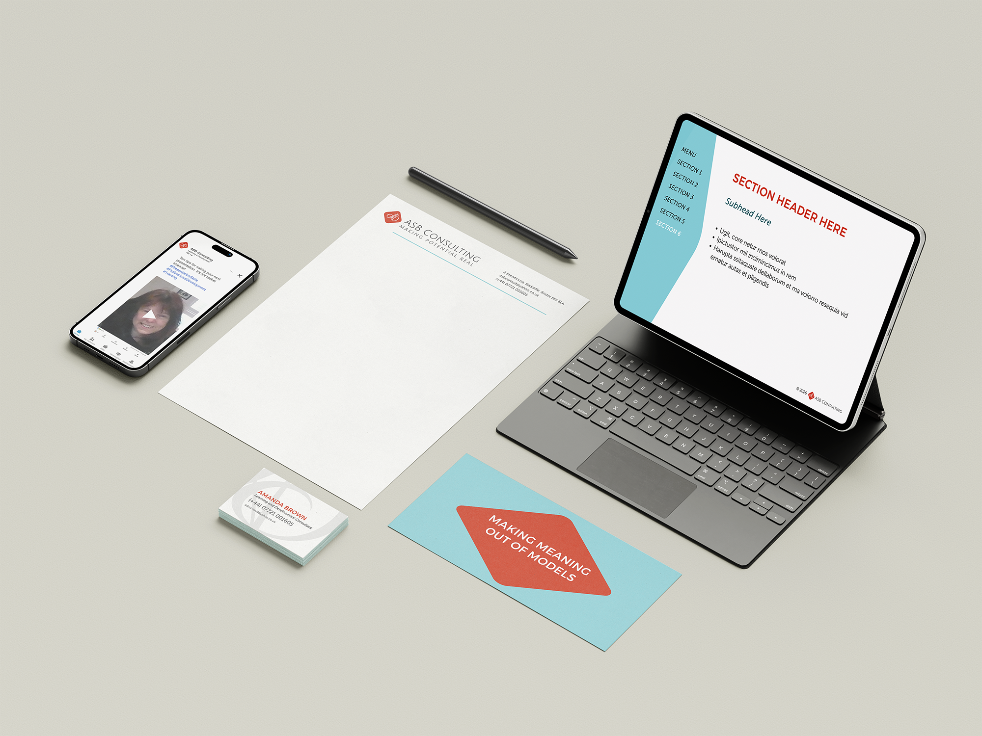
ASB Consulting is a solo learning and development consultancy. The brand offering is face-to-face training programmes, so it made sense to base the logo on the founder's signature, stylised and simplified to incorporate the three initials.
The brand development included a verbal identity, including a strapline, and a visual identity which used a diamond to represent the polished results of training, forming a holding graphic across touchpoints.
“Slipway have done an excellent job in helping me to brand my consultancy. The design was stylish and done with a sensitivity to what I needed to say about my services.
Rik came up with several options and listened to feedback to create a brand pack that will support my business for any requirements that my clients might need from me.”
Amanda Brown, Founder